
CA APPLICATION TEST
VR FOR SOFTWARE DEVELOPMENT
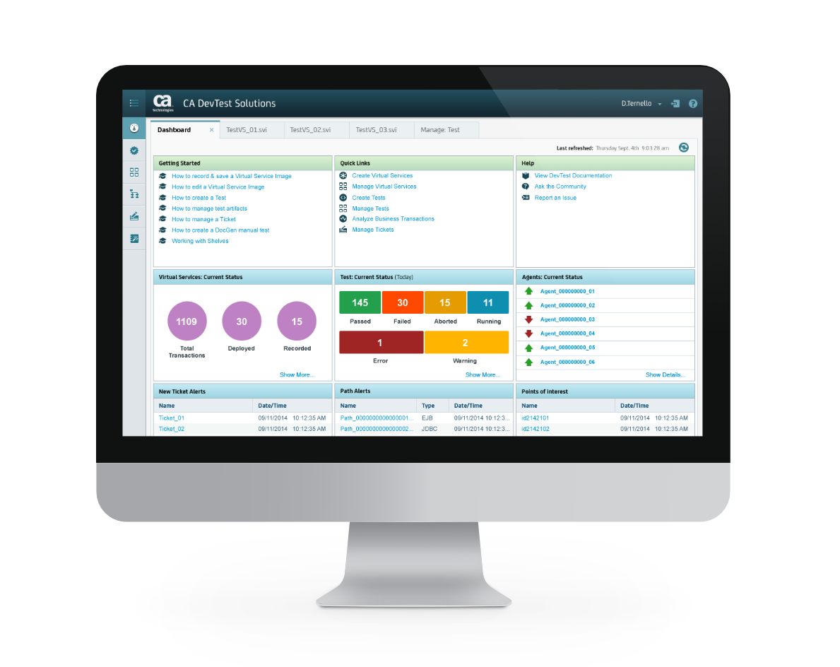
CA DevTest is a suite of products focused on providing development teams all the necessary tools to capture, simulate, and test complete composite application environments. Making these composite application environments available to development and test teams throughout the software lifecycle allows for faster time-to-market with quality software functionality at lower infrastructure cost. The main set of tools consists of a service vitualization tool, an application testing tool, and a system analytics tool.
ClIENT
CA technologies
PLATFORM
Web (Desktop)
TIME FRAME
Sep 2014 - Apr 2016
TASK
Transform a legacy thick-client application into a leaner web-based application that is simpler and easier for users of all levels. And also rebrand the application to fit the new corporate brand language.
[ Junk Text: CA DevTest provide development teams an end-to-end solution that accelerate software release cycle times with improved quality. which will reduce it' learning curve, increase user adoption and express a modern and simple UI.the entire experience to be more delightful and eliminate any usability constraints, while also giving CA DevTest a fresh new appearance to instill a sense of simplicity and to reflect CA' brand ethos.]
MY ROLE
I was one of three designers on this project. My main roles were as a UI designer and visual designer, though I also participated in the UX aspect of the project.
Tasks included:
- Heuristic evaluation
- Defining personas
- Competitive evaluation
- Usability testing
- Information Architecture
- UI and visual designs
Design Methods and Tools
- User studies
- Persona creation
- User journey maps
- Heuristic evaluation
- Card sorting / IA mapping
- A/B Testing
- Hand sketching
- Balsamiq Mockups (for quick lo-fi wireframes)
- Axure (for mid-fi wireframes and high fidelity pixel perfect prototyping)
- Photoshop (for mockups and asset creation)
- Adobe Illustrator (for DLS creation)
- Sharepoint (for team collaboration )
- WebEx (for team meetings and user testing)
INTRODUCTION
CA DevTest, formaly known as CA LISA ( iTKO was acquired by CA in 2011. The product was then known simply as LISA ), was a legacy applications with a vast set of robust features. Recognized as one of the most powerful tool on the market, CA LISA was equally known for it' large footprint, clunky, unintuitive UI and steep learning curve.
In 2014, with DevOps gaining popularity and more web-based tools emerging, CA LISA underwent a transformation in order to remain an innovative leader in the new digital economy. This was a multi-phase project spaning several years with the intent of gradually re-designing and porting CA LISA' entire tool set to a new web-based platform and introduce a new gereration of users to CA DevTest.
THE CHALLENGE
CA LISA, originally a thick-client product, must become leaner, more intuitive and simpler to use in order to meet the demands of a modern agile team, and compete in the market place.
As more organizations utilize the agile methodology to improve their development process, testing tools must evolve as well, and not themselves be a hinderence to dev teams.
CA LISA, being originally a thick-client product, which tend to have large footprints, have vast arrays of features, and also tend to suffer from poor usability and accessibility. meet also meet specific orgaizational requirements to satisfy the demands of a modern agile team. But with the level of sophistication that is necessary to tackle any size project, these tools can also be complicated to use. They can cause frustration and delay in the pipeline that can even affect release cycles.
Need to be more declarative, rather than speculative. Checkout links of site that reference the difficulty of DevOps. Might help.
HYPOTHESIS
CA DevTest will need to become lighter, yet remain robust enough to meet the demands of the industry while being more intuitive and simpler to use, for current and future users.
CA LISA, which dominated a large portion of the SV market share early on, would need to go through a transformation in order to compete with new SaaS based tools that are finding their way into the market. Without this transformation CA LISA would be expected to lose market share to lighter, more powerful tools are are also easier to use.
PROJECT SCOPE
This project was developed using a multi-phase approach, starting with a product portal and a set of tools, each tool include, as an MVP, a subset of the full feature set offered in CA LISA.
- CA DevTest Portal
- CA Service Virtualization
- CA Application Test
- CA Application Insights
PROCESS
DISCOVERY
To get started, I spoke with two of the founding members, which were also heading the product management and engineering team. I asked them to share with me the why for this business and their vision of their product/service. What are some of the core needs they are fulfilling, and how they envisioned their users feeling when they used their service.
- Transparent to the workflow
- More stable environments
- No hardware dependency
- Less Stress
- More efficiency in the CI/CD process
This would also help set the tone and aid in exploring ideas for the visual design later on.
USER INTERVIEWS & SYNTHESIZING PERSONAS
In order to have a deeper understanding as well as have a more empathetic view of those that will be using this tool/service, I interviewed some participants that would represent the target user as close as possible. The management team had given me a list of roles with a short synopsis of who they felt represented their target users.
Their list consisted of:
- QA Tester, as the primary user.
- Software Engineers
- IT operations
- Manager of Developers
- Systems Administrators
I initially anticipated interviewing between six to seven participants, but due to budget and time constraints, we were only able to recruit 3 participants within the planned time frame and so I approached this study using a guerilla style method and aimed at producing proto-personas.
The participants were:
- 1 Technical Architect
- 1 IT Operations Engineer
- 1 Development Manager
My only concern was that three participants would be barely enough to expose patterns that would help me develop reliable personas. As per Cooper, a minimum of five to seven participants is necessary to yield better results.
But since the roles of these participants were within the list provided to me, it gave me a better than zero chance of uncovering usable information.
[show image of people talking, or list of questions]
[show images of markedup transcriptions of user interviews]
Surprisingly, there were some insights that surfaced after the interviews and analysis were done. Some of these were…
- There are four distinct personas that would be the likely users of this tool/service instead of five.
- The primary being the Developer. This is the one who’ll probably be using the tools within the service almost on a daily basis.
- The second being the Tester. Who is likely to interact with the tools less frequently.
- The third being the Development Manager. This persona would be a very light user. With only occasional use. Will likely just monitor deployments and address minor issues as they arise.
- The fourth is the Administrator. This persona would be responsible for managing users, deployments as well as monitoring resources for their respective organizations. This persona would oversee many organizations and monitor deployments frequently to ensure development teams are not being blocked.
- Another interesting insight is that IT Operations will likely be the person to push for and set up the tool/service, but would share the role of administrator with the development manager.
[Show images of the analysis stage here]
[show images of the personas here]
COMPETITIVE ANALYSIS
After identifying our target users I set out to know who the competitors were in the CI/CD landscape. My goal was to know what solutions they offered and to identify the key differentiators. To do this I set out to do a high level evaluation of the top 5 tools in the industry by comparing capabilities, technologies and how well they performed in the wild through industry reviews.
This would give me insight on whether any performance issues are due to technology or usability.
Some insights:
- Many of the competing tools focus only on niche technologies. So what may seem like competition, might not necessarily be.
- Some offerings come with high overhead cost, such as in the time it would take to set up. Complications during setup, and the propensity of errors in the orchestration process, since it’s mostly done manually.
- Constant change in technologies. While this may seem like a good thing, it doesn’t always mean easy adoption for teams.
But for those capabilities that did compete with those in NimbusStack, it gave me a good sense of where we would need to ensure a more delightful experience.
USER JOURNEYS & WORKFLOWS
After having gathered the business requirements, competitive data and the personas on hand, I needed to start thinking of how developers and testers would implement NimbusStack into their continuous integration pipeline. And so to do that I started sketching out user journeys and workflows to get a better understanding of how our user would fit NimbusStack into their workflow.
[image of user journeys / workflows]
INFORMATION ARCHITECTURE
Around this same time I was starting to also think about the information architecture.
But before diving in too deep into the navigation, I started out with setting up a card sorting exercise to confirm some of the labeling and categories we had encountered during the competitive analysis and user journeys, which we initially felt were appropriate since they were not only recognized within the target industry but we felt our competitors would have done enough research on their own to justify the use of these labels as well.
We opted to use an online tool since this method allowed participants to do the exercise at their leisure instead of the in-person method which would’ve been too challenging for some of the participants to commit to.
[images of online card sorting ]
Doing the card sorting exercise would also give us a starting point for determining the navigation and search method. Considering the initial MVP requirements it was determined that a simple flat architectural pattern is used since our study also indicated that these categories carried equal weight. This appears to be consistent with our observations from the competitive analysis.
[images of IA]
[images of workflows]
WIREFRAMES, TERATIONS, AND PROTOTYPES
RWD
Though it wasn’t specifically requested, and because we discovered through the user study that this service is not likely to be used from a tablet or a mobile device, I still took a mobile first approach to designing the UI since this would avoid redesign work down the road.
Once we had the IA in place, I started to quickly hand sketched wireframes to capture initial ideas and thoughts on the workflows for testers/developers and administrators.
Working from a mobile first approach, I sketched out wireframes for various screen sizes and working my way up in fidelity with every iteration. I shared these wireframes with the rest of the team to get feedback during our status calls every other day.
[images of hand sketches]
[images of balsamiq screens]
[Images of RWD in AI]
[images of axure screens]?
USER TESTING
At this point we wanted to start running the wireframes through external folks to ensure we’re getting unbiased feedback as well.
There were several iterations we considered some minor updates were made, such as the adding the .
After the testing we found that the majority prefer the menu on top, and the navigation on the left side.
Design Language / Mood board / color palette
After the main wireframes were approved, my focus then turned to the visual design aspect of the project.
To get started I began exploring ideas for a moodboard. This would help me to solidify the vision for the product. But before experimenting with tints and shades, I needed to take certain things into consideration when building the visual language, such as the visual hierarchy as well as a color palette that is friendly to color blind users without altering the product brand.
To reflect the corporate vision for the product as well as establishing the style that resonates with users, I started out with a list of characteristics that would inspire the kind of vision I was after.
- Light
- Uncluttered
- Solid
- Reliable
- Clean
- Simple
- Friendly but strong
From this I developed several color palettes which I then shared with the rest of the team and come to a decision.
Logo Design
Though I started design work on the logo, I was informed that a logo had already been produced. At this point, I wasn’t sure what to expect since the logo design may have its own set of requirements, such as a color palette, size, or where it was intended to be placed. And so I started exploring design options around these points. After exploring several different color options, I presented a couple to the management team and they choice one they felt reflected their vision.
[Show images of sketches of logos]
[Show different color schemes used on the NS logo]
[Show image of final logo design]
Style Guide and other deliverables
At this point I was ready to work on the UI design portion and started by creating a style guide and visual specs to share with the development team. I used axure to consolidate all deliverables since it allows me to publish documents as well as provide links to assets that are readily available and accessible by all team members.
[Show images of several UI kits ]
Prototype and final update prior to signoff
A high fidelity prototype was produced to demo to management as well as for a user study. Study results were then used for final updates.
[show screenshots of the prototype - also provide link of prototype here]
Lessons learned and final thoughts
Being the only designer on the project meant I would not have the luxury of time to work in a sequential manner in order to keep pace with the development team.
We opted to use an online tool since this method allowed participants to do the exercise at their leisure instead of in-person, which would’ve been too challenging for some of the participants.
There were challenges we encountered, particularly around the scheduling of participants.While I was already aware that this could be rather tricky, I was not expecting the sequence of tasks to be I would need to experienced some challenges along the way since I didn’t have the luxury of time. Particularly around executing the design process in a sequential format.
to work in a serial
Future Considerations
While our most recent user studies indicated the last iteration was a clear improvement, particularly around the navigation, there are other areas that will need to be addressed.
While some of these are not necessarily critical to the success of the product, it will inevitably increase the overall experience. Some of these areas include consistency in UI patterns. And further studies will need to be conducted with every update.
©2023 Miguel Rivera